The New Uber Logo 2018
The start of September saw the release of a new Uber logo which features a simple design compared to their previous logo designs in recent years. The redesign of their logo comes two days after they hired their first chief of marketing. Uber have simplified their logo opting for their name in black and white, ditching the previous graphical image that was changed in 2016.
Uber is now the biggest private company in the world, taking over other private companies such as Airbnb. It operates in over 600 cities and is looking to go public in 2019.
The History of Uber and their Logo
Uber have had a vast timeline of previous logo designs which dates back to when the company began in 2009. Not only have their brand identity seen drastic changes but also the structure of the company. Uber was developed during the boom in ‘shared economy‘, enabling anyone with a vehicle to give others a ride at a affordable price. Uber undoubtably dominated the ‘shared economy‘ market whilst other companies crashed and burned.
When the company began in 2009, founded by Garret Camp and Travis Kalanick, they started with the name ‘Ubercab’. Their first logo featured a bold ‘uc’ followed by their name ‘Ubercab’ directly underneath in black. The font was thick and bold in design-hard to miss.
![]()
In 2010, shortly after the company began the name of the company was shortened to ‘Uber’, their logo also following suit, featuring the same red and black design however with a singular ‘u’ followed by ‘Uber’ this time above the graphic.
![]()
This logo was used for the next year until it was changed again in 2011. This time Uber ditched the black and red colour scheme and opted for black a white. This logo featured a design with a slimmer font along with the modern colour scheme. The aim of their new brand identity was to make the logo look more luxurious as it was around the same time the company introduced UberX.
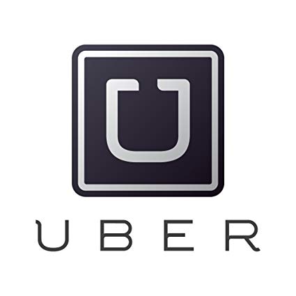
In 2012, Uber dropped the graphic leaving the logo as just the companies name, however, the font stayed the same. The gave the company a simple however still luxury looking design. Uber kept this logo for four years which is the longest time they have kept any of their logo designs. It was in these four years that Uber became a global brand, being used in over 78 countries.
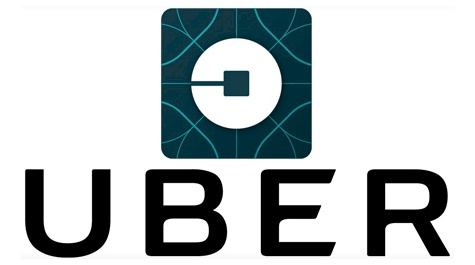
![]() It was in 2016 when Uber then released a new logo, bringing back the graphic feature that they had previously ditched. Their new design was completely different from their previous logo’s with an abstract flair. Uber shared their inspiration for their modern and innovative logo, indicating that they had been inspired by the bit and the atom. The ‘u’ was no longer central to the brands logo and the white and blue colour scheme was favoured for its luxury composition.
It was in 2016 when Uber then released a new logo, bringing back the graphic feature that they had previously ditched. Their new design was completely different from their previous logo’s with an abstract flair. Uber shared their inspiration for their modern and innovative logo, indicating that they had been inspired by the bit and the atom. The ‘u’ was no longer central to the brands logo and the white and blue colour scheme was favoured for its luxury composition.
The New Uber Logo 2018
To match the foreboding logo trend for 2018, Uber’s new logo shows off simplicity. The new Uber logo is black and white in terms of colour and features only the company name. Unlike previous logo’s where the font is in capitals, this logo is in lowercase.
![]()
Reportedly, their aim was to bring back the ‘U” as their 2016 logo was not as easily recognised as previous logo designs. Not only did they change the design of their logo, Uber also changed their mission statement from “Make transportation as reliable as running water, everywhere, for everyone” to “We ignite opportunity by setting the world in motion.”
Which logo design was your favourite?